Modern Retreat on Spring Lake

A home perched on the banks of Spring Lake gets an update and a shot of design with help from a local designer.
Dr. Susan Shattuck said busy careers kept her and husband, Doug Fryett, from putting much effort into the home they built in Spring Lake’s Beaux Rivages neighborhood in 2004. When she was ready to redo the home, Shattuck heard that her go-to decorator, former Shreveport interior designer Stephen Forte, had moved out of the area. By chance she found the design team at space: interiors on a list of Shreveport decorators on houzz.com. She called and got the ball rolling on her redesign.
“I said I want this done and started without my husband’s knowledge,” she said. “I just wanted to get it started, get it going and let him be surprised.”
She said lead designer Myron Griffing and project director James Osborn showed her some plans, and they decided to start work when Fryett went on a trip to Australia.
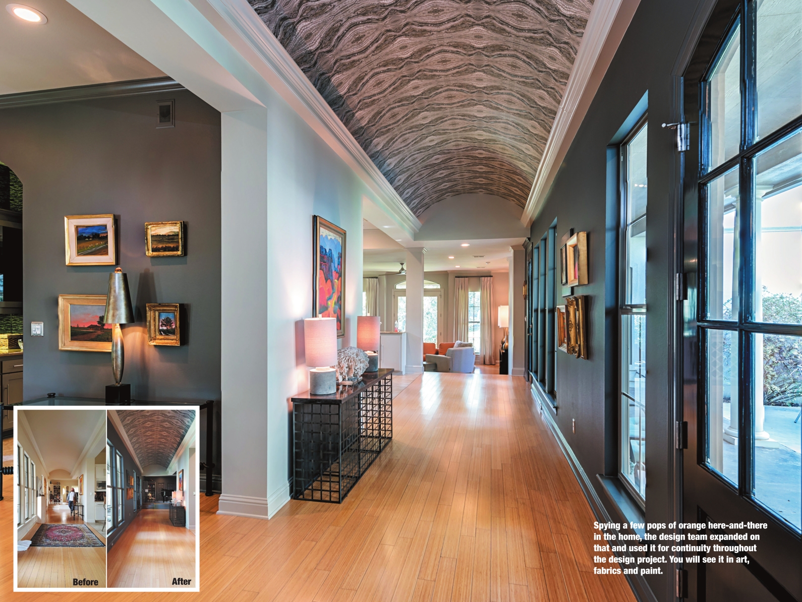
Griffing said the original plan was to use an ombré of color from black in the music room to white in the living room. Instead, the final product is a mixture of different shades of gray tied together with geode pattern wallpaper from Caddo Paint on the entry hall’s barrel vault ceiling.
“That was a huge step to put the wallpaper on the vaulted ceiling. They were right, I was wrong,” she said. “The wallpaper is stunning, and it flows with the color.”
Shattuck said her husband was surprised to see the dramatic changes when he returned home. The front door was painted black, the hall and music room were dark, and the kitchen had been redone. It wasn’t finished, but work was well under way.
The wall along the entry was painted dark gray to highlight it, and the door painted black so it would be unnoticeable when looking into the courtyard. DeLoach Painting did all of the painting in the home.
“The darker you paint stuff, the more it almost disappears,” said Griffing. “Like a black chain link fence – you see through it – versus a regular chain link fence where it’s like, ‘Hey, a chain link fence.’” The geode wallpaper has a bit of sparkle in it, as well as all seven different shades of gray used throughout the interior design of the home. Griffing said that is another way to unify a multitonal space. “You have two things – one thing that is consistent throughout and one thing that contains all your colors that you’re using. As wild as it is, it’s got a very natural feeling,” he said.
He said another design element he utilized was the molding. It is painted the same color in each room to unify the spaces. “That’s an element that’s present in each room – that same molding color,” he said. “That helps transition from one color to the next.”
A console table in the hall was moved to the dining room, because the hall needed a longer table to fit the scale of the space. The braided metal console table came from Dillard’s in Pierre Bossier Mall. Griffing said it is airy but has a definitive presence, and the top is reminiscent of the geode wallpaper above it. “We shop everywhere. We may pick up something at an estate sale, or a junktique store, or Dillard’s, or Paul Michael, or Briggs & Co. We mix everything up,” he said.
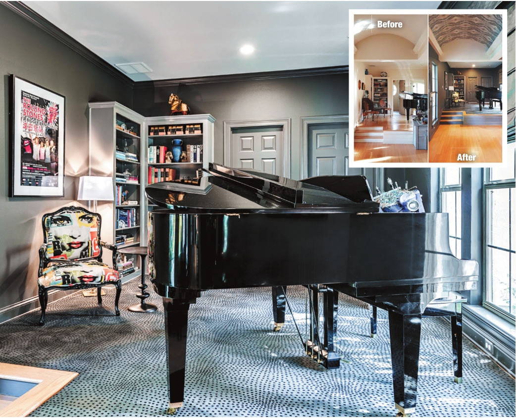
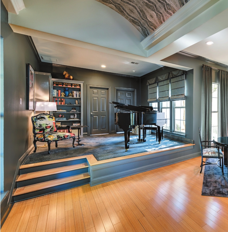
The music room lies at one end of the hall. Since the room is raised, Griffing said they wanted to go stark with the design to give it a mysterious, special room vibe. It doesn’t have wall-to-wall carpeting – that’s actually a custom rug from Shreveport’s House of Carpets & Lighting cut to the room shape. Standout pieces in the room include a piano, a Rolling Stones concert poster, and a chair Shattuck calls “Miss Lips.”
“We thought it appropriate to put ‘Miss Lips’ next to the poster of the Rolling Stones,” she said.
The story behind the Rolling Stones poster is a good one. Shattuck said Fryett was in mainland China for a meeting when he got the opportunity to attend their concert in April 2006. She said it was the only concert the Stones ever played in China, and the country’s censors had forbidden them to use some of their lyrics and songs. A friend of Fryett’s was in charge of food and beverage for the event and scored a backstage pass for him.
“Was I jealous? Oh, yes. He’s not a big Stones fan, and I am. He’d never seen them before, so what does he do? He gets a backstage pass,” laughed Shattuck.
She said posters were not sold at the event, but Fryett spied one in the stadium – torn a bit. He took it down, rolled it up and brought it home.
Griffing said the fabric for the chair was chosen before they knew about the poster. “We hadn’t even seen the poster yet, and it was just kind of perfect,” he said.
He found the fabric at Nest Fest in Bossier City, where he saw it on an old chair that Milling Around owner Amanda Haynie had reupholstered. Griffing said he loved everything about it, and so did the homeowners. Fun fact: The chair was painted at Raney’s Auto Painting in Shreveport.
Shattuck’s office is on the other side of the music room. She said the existing furniture was moved around, and paintings were cleaned and hung in new locations.
The painting behind the desk was done near the hospital in Newfoundland where Shattuck was born. “It’s a little inlet, and in Newfoundland little inlets are called ‘tickles.’ This tickle is Quidi Vidi (pronounced Kiddy Viddy) tickle, and it’s in St. John’s, Newfoundland,” she said.
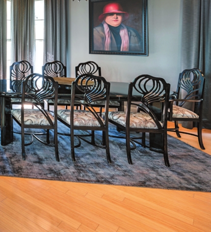
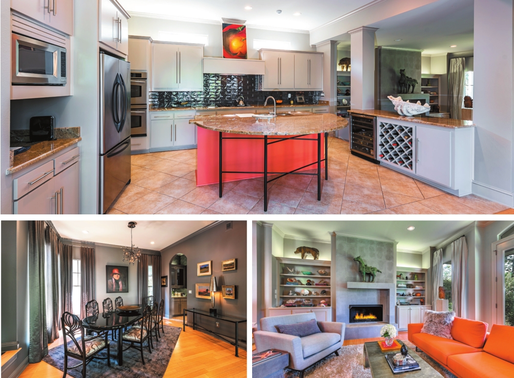
The dining room table remained, and the chairs got new geode-like fabric to complement the hall ceiling. Forte purchased the table for the couple in the 80s. When Griffing posted photos of the finished home online, he said Forte saw them and recalled purchasing the pieces for Shattuck and Fryett.
Virginia McKinnon designed the drapes in the dining and living rooms. The couple’s favorite piece of artwork – a painting of a lady in a red hat – was moved from the stairwell to a more prominent position in the dining room. Griffing said the painting makes sense in the room and stands out against the newly darkened walls.
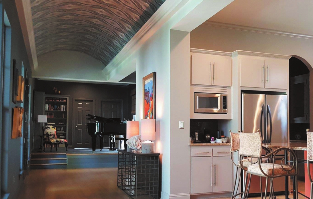
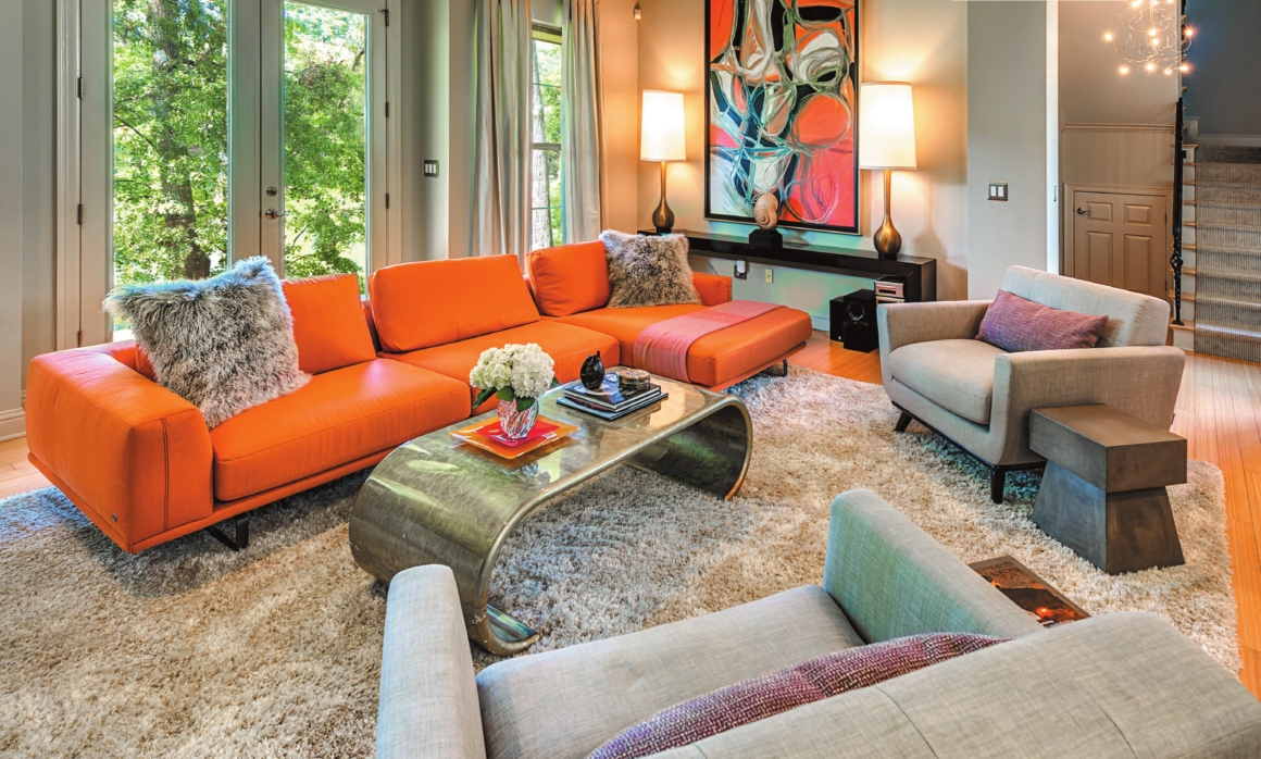
The kitchen backsplash and vent hood were replaced by Locke Homes & Remodeling, and the paint was freshened up. The only item left to update in the kitchen is the barstools. The kitchen island was painted the same shade of orange as the Italian sofa in the living room.
“I talk about repeating elements; well, that includes color as well,” said Griffing. “They had that Italian sofa down in the living room. Each room has a variation of that orange. It’s one of those things that you don’t know why it looks so good, it just does.”
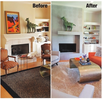
The living room was already home to the sofa and a fiberglass waterfall coffee table Forte had also helped Shattuck choose. Shattuck wanted a retro 50s look for the chairs, and the Jackie chairs (called that after Jackie Kennedy) were chosen. She also wanted a contemporary fireplace, so the existing fireplace got a facelift designed by Griffing and built by Locke.
Griffing said the fireplace is a piece of art. “It’s a sculpture that complements the room and doesn’t overpower it or distract from that really cool artwork from Nader’s that’s on the opposite side (of the room).”
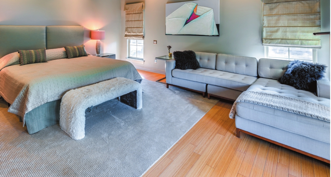
The master bedroom is on the second floor. “The ceiling was our bugaboo,” said Shattuck. “We found the (wall) paint color to go with the headboard, but we couldn’t figure out the (ceiling) paint color. So we put up some wallpaper … it’s got little iridescent dots.” New nightstands and lamps were brought in, and a streamlined sectional from Nader’s replaced a chaise lounge. A painting made in 1987 by local artist Dennis O’Bryant hangs in the room. The burlap-and-paint piece represents a mother holding and looking at her child, and previously hung in Shattuck’s Ob/Gyn practice until she retired.
A bench at the end of the bed was recovered and adds a pop of fun to the space with its luxurious, furry texture.
“When we walked in that first night and turned the light on – the way they had decorated this room – we were just blown away. We loved it instantly,” said Shattuck.
Griffing said he and his team of Osborne and studio manager Rebecca Hays work well together and have fun with their clients.
“We love transforming it … and putting a higher level of design to it,” he said. “Our job is to come in and use what they have and find things to enhance and complement.”
You can see more of space: interiors’ design at spaceinteriorsla.com.
