An Inviting New Look

Located in the Sun City subdivision in south Bossier, the home shown here previously belonged to homeowner Ginger Disante’s parents. The family is full-blooded Italian, and Ginger and her sister made memories together during trips to Italy, where Ginger found inspiration for how she wanted her kitchen to feel and function. The siblings visited Tuscany a couple of times a year and stayed at a favorite vacation spot.
The charming bed and breakfast they visited offered cooking classes.
And in true Italian style, all the guests would gather to cook and eat together. “[Ginger] loves that. She’s a big cook,” said Ashley’s Building and Construction owner Lisa Willard. “She wanted to capture that Italian feel in her parents’ home now that she’s going to live in it.”
Disante wanted to remodel the space and have the Tuscan/Italian elements in the kitchen. Now she can use the cooking knowledge she gained into practice and have her family gather together in the updated room.
Disante had a vision, and Willard helped make the dream a reality.
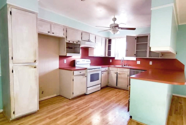
We gutted the entire space. I sat with Ginger to lay out the design. She wanted an island. She has grandkids, so she wanted to have the island to prep and bake,” Willard said. “She does handmade pasta. Her sink was where the window is, but we decided not to put the sink there again. It was just too close to the cooking area. We wanted it centered on the island to do her prep work and then turn around and wash up and do things. She wanted a pull-out garbage with a cutting board over it with a hole, and she wanted a wine cooler/beverage cooler. Because if you love Italy, you love wine. We (also) gave her an appliance garage on the counter for her coffeemaker or small appliances.
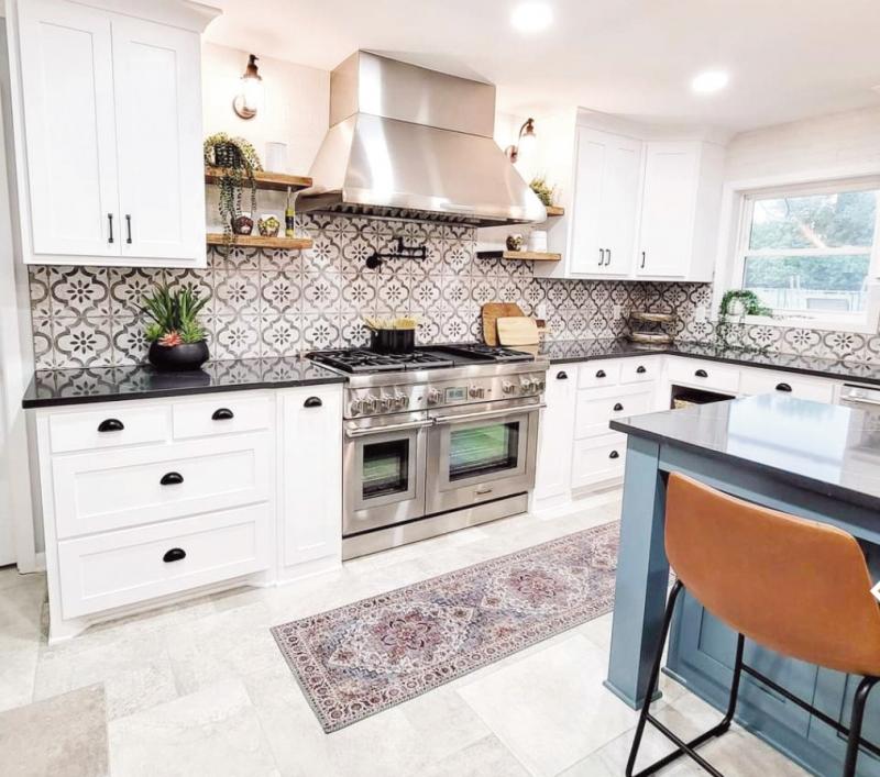
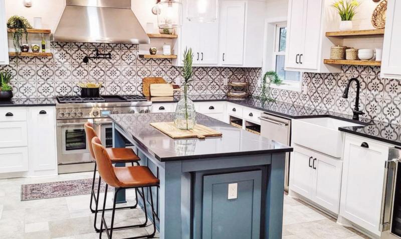
“On the opposite wall are where all her pantry and her Thermador refrigerator are. All of the appliances are Thermador. I didn’t want to take up any of the pantry space, so we gave her a microwave drawer in the island. And then blue was a color that she wanted. The backsplash is halfpatterned and half-white vintage brick on the top. The shaker-style cabinets have a mixture of arch and cup pulls.”
Willard summed up part of the invitingness of the kitchen: “open shelving. “I hate to see just a straight line of cabinets; I like to break it up with some open shelving or glass-front cabinets. I like lots of fun things for your eyes to land on. There are sconces over the open shelving to make it feel like you’re bringing some outdoor inside. We always use a higher Kelvin light whenever we put in can lights. We put in 4,500 to 5,000 Kelvin lighting, a lovely bright white light as if you were outside in the daytime.”
The counters are quartz and almost look like soapstone. Open cabinetry with baskets gives a little extra visual texture.
Disante also makes teas a lot, so she wanted a small hot and cold faucet to the right of her kitchen faucet.
The flooring is from Italy, and its porcelain made to look like natural stone. The idea was to mimic some of the cobblestone stone floors that you would see in homes in Italy. The tiles can be installed in two or three different ways. Diana and Lisa chose this particular pattern to complement the space.
The island is painted Sherwin Williams’ Labradorite Blue. Sections of the walls not covered with tile are a shade of gray. Lisa found the leather barstools at At Home. The lighting came from Wayfair.
“When we meet with customers, we show them materials they’ve described that they like, or they send an inspiration photo to me. I find things that are exactly or close to what they want, but we put their spin on it,” Willard said.
“The cool thing that she likes, and all our customers like, I measure and take pictures and put the existing room through my CAD software. I start working my design magic. Kind of like HGTV, where they tell clients, ‘This is what it could look like.’ I put all the materials they like in the design. So when we meet with them, we have a floorplan view and a 3D walk-through view. It gives you a good feel of what it will be like and feel like when you’re in the room. Our customers love it when they see their new design.
“We have fun. It’s kind of cool when you wake up and get to do what you always dreamed of doing for your whole life.”


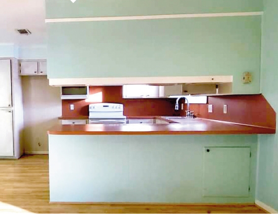
When Ginger Desante decided to move into the family home, she wanted an inviting new look for its outdated kitchen. Overhead cabinets were removed between the kitchen and adjacent dining space, and an island replaced it. The tile backsplash links all of the elements of the room.

A brand new view! Removing the former built-in and overhead cabinet opened to the kitchen to many more possibilities, including an island featuring an eat-in area and a microwave drawer.

A Thermador range and hood take the kitchen to the next level for inspired cooking. The flooring is from Italy and is porcelain made to look like natural stone.
