AT CRITICAL MASS 6

 Local Events
 A community celebration and a treasure hunt with difficulties
Critical Mass 6 at Shreveport Regional Art Council’s (SRAC) artspace offered any artist who submitted their artwork a chance to see it on the walls of this vast, wood-floored, two-story gallery. There was no jurying process, which meant that anything entered automatically got in. Despite the lack of a curatorial premise or know-how, the energy and effort of the works on display kept people looking, especially on opening night; it’s clear that the artists in Northwest Louisiana are proud of what they make. What was lacking here was organization and curatorial direction.
Browsing through the 150+ artworks in Critical Mass 6 should have been an all-encompassing, enlivening experience. But because of the incredibly boring style in which the works were displayed, it was not. Like a singlefile line down to the bathroom at an outdoor concert, where everyone is just standing there waiting to get in, the two-dimensional work and some of the small threedimensional work on both floors were hung at eye-level, arranged simply as one thing after the other. Some of the works were clustered together if they had some aesthetic or thematic overlaps; for example, Mark Ryden’s lookalike images were clustered together on the first floor, while landscape paintings and bucolic scenes also ended up in little groupings. Abstract works didn’t get grouped together, however; they ended up peppered throughout the walls. Since these groupings were already apparent, why not just be purposeful about them and name each cluster? This show would have greatly benefited from some sort of curatorial organization. Going through each work at eye level added a dullness to an already sprawling, unwieldly exhibition of randomly organized work.
Aside from this lack of curatorial direction, none of the artists in the show were asked for artist statements or any explanation of their work. For an artist to be taken seriously, they usually need an artist statement — having one generally separates Sunday painters from more serious artists.
It was unclear who attempted to be a serious artist, and who was just a hobbyist or Sunday painter.
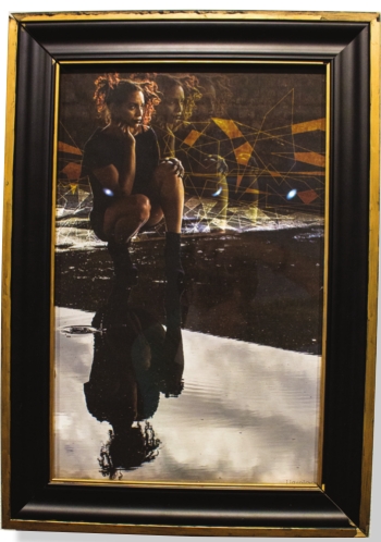
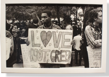
Discovering works that were better than others was like a treasure hunt. The Best in Show piece, Joshua Chambers’ gouacheon-paper, “Aim as Far as Possible,” a depiction of a monkey drilling into his own boat, was hidden in the back. Chambers’ small painting stood out because of his skillful yet delicate drawing, and the use of dark humor. Honorable mentions like Jazmin Jerrigan’s “Into the Looking Glass,” a multi-layered depiction of a girl contemplating existence, and Ransom Ashley’s “Love Not Greed,” an archival photograph from a social justice rally, were also barely visible. It was a shame to have smaller works like these given lame real estate, while several bland abstract paintings took up a lot of prime space on the first-floor gallery.
Furthermore, after the honorable mentions and best of show were announced, why not re-organize the show to highlight those? Instead, Karen LeBeau’s “Do Whatcha Want,” a festive painting of a Mardi Gras street scene, was barely visible on the second floor next to paintings of animals and other random abstractions. If this show is to truly benefit the artists who submit the work, a curator must be involved to guide the ways the exhibition is organized and presented. Otherwise, it’s just a critical mass of stuff.
Alicia Eler is the visual art critic/arts reporter at the Minneapolis Star Tribune and author of “The Selfie Generation: How Our Self Images Are Changing Our Notions of Privacy, Sex, Consent and Culture” (Skyhorse).
